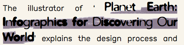
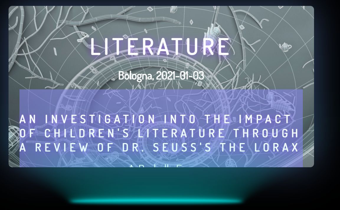
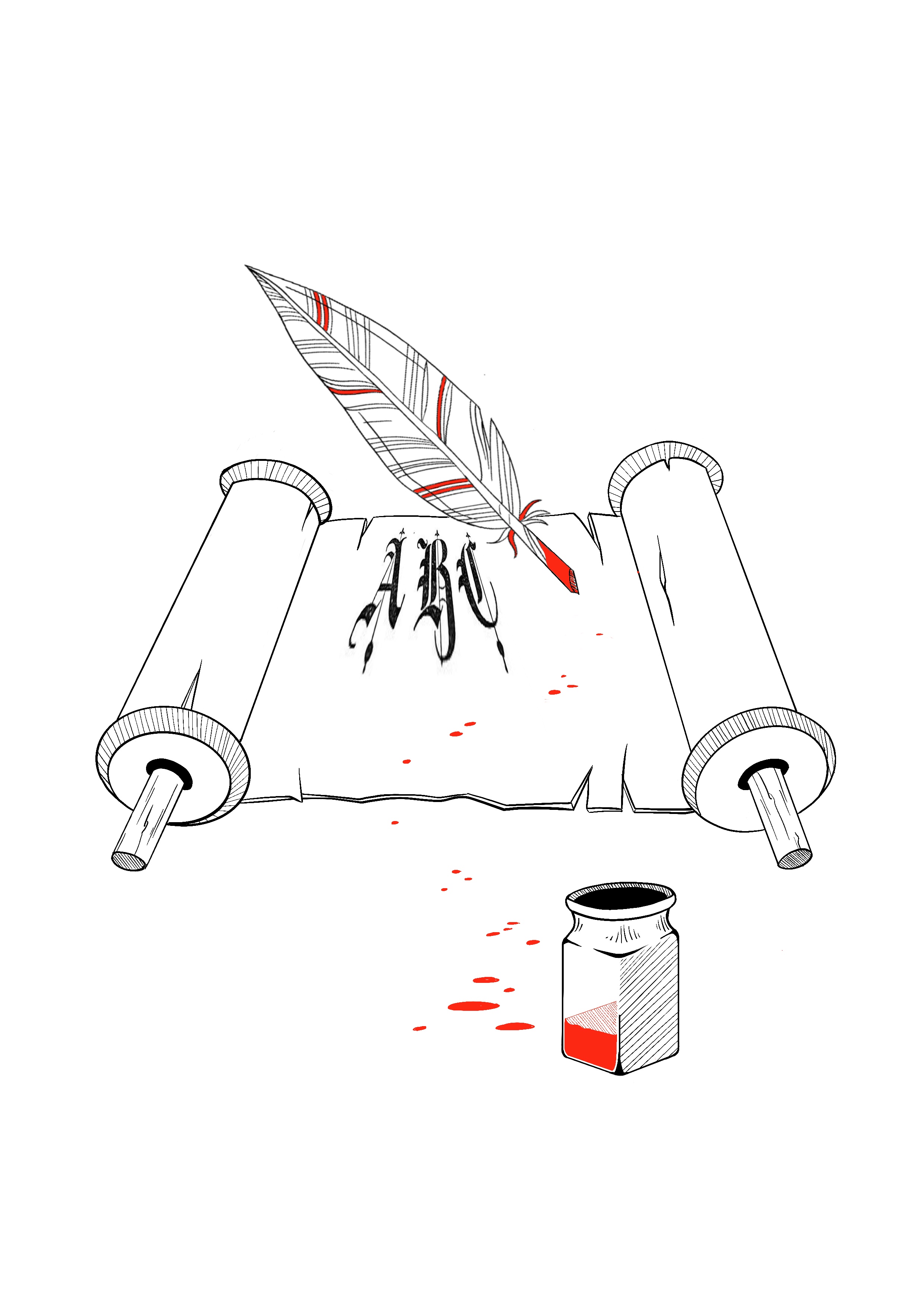
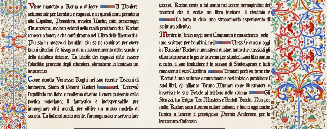
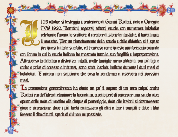
1450
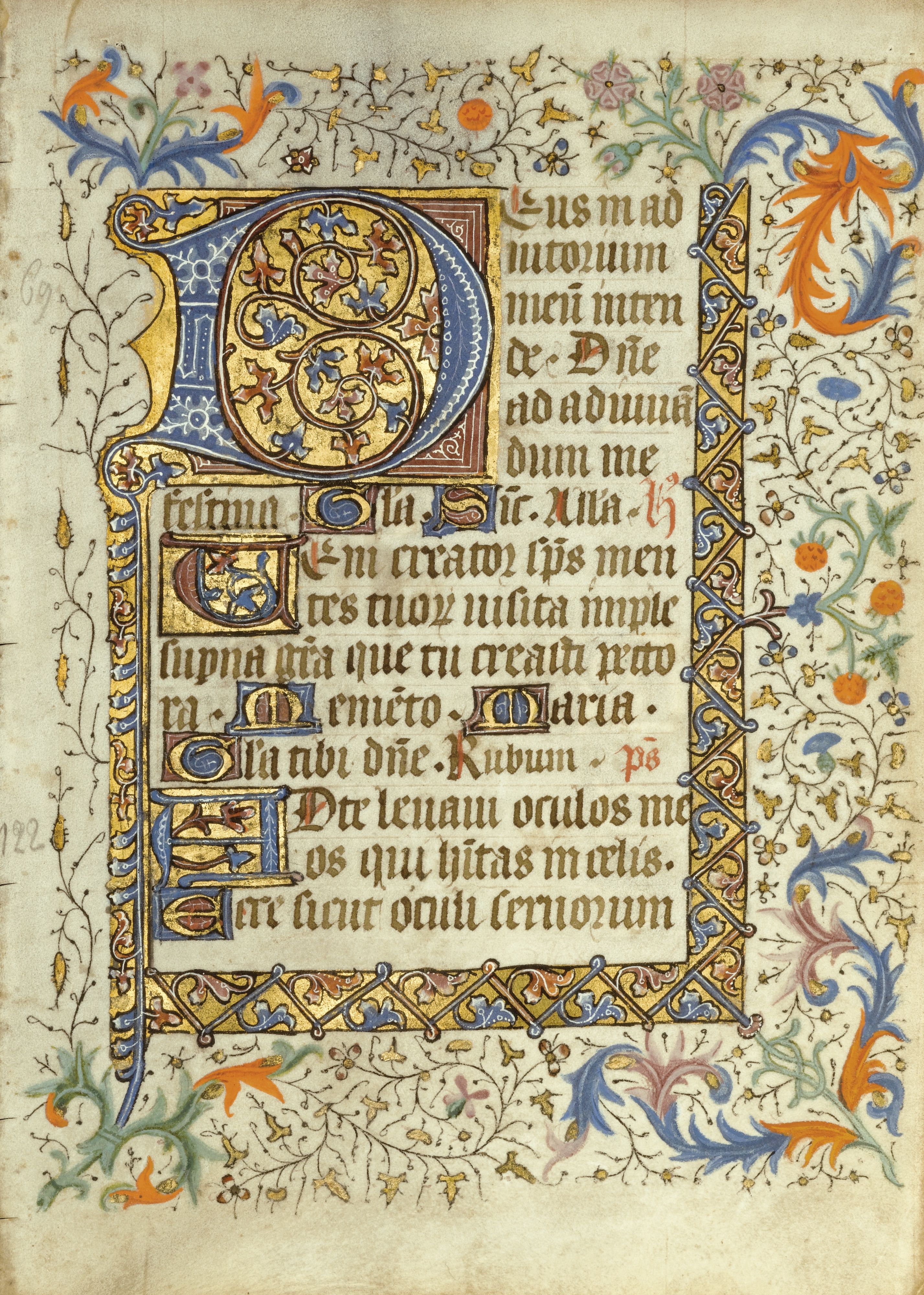
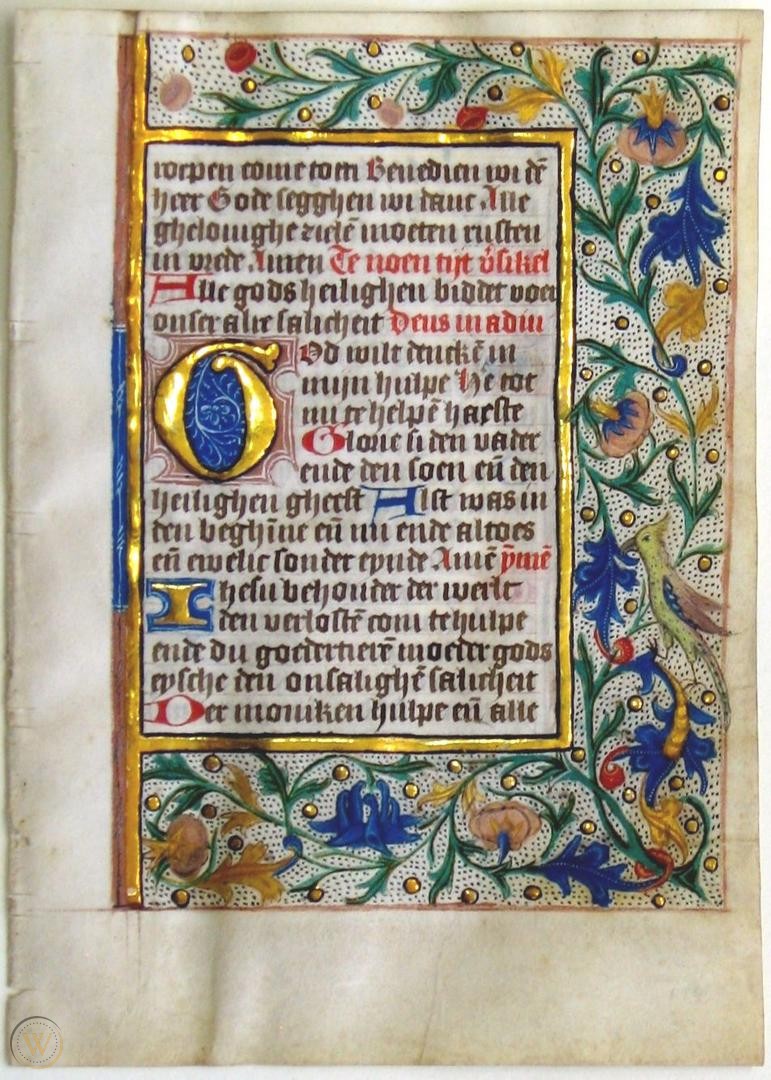
As for the pre-1500 style, I decided to draw inspiration from Western illuminated manuscripts, specifically the late medieval / early Renaissance ones.
In fact, I thought it might be interesting to try to reproduce a structure that would give a lot of space to the decorative aspect. I analyzed numerous codices, trying to abstract the most significant and recurring elements, to create a summary layout.
In the process of reproduction, I tried to achieve the right balance between historical rendering and legibility. Consequently, I opted for a lightening of the decorative aspect, while still trying to stick as closely as possible to the original examples
Layout
Page organization: columns, paddings and margins
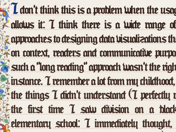
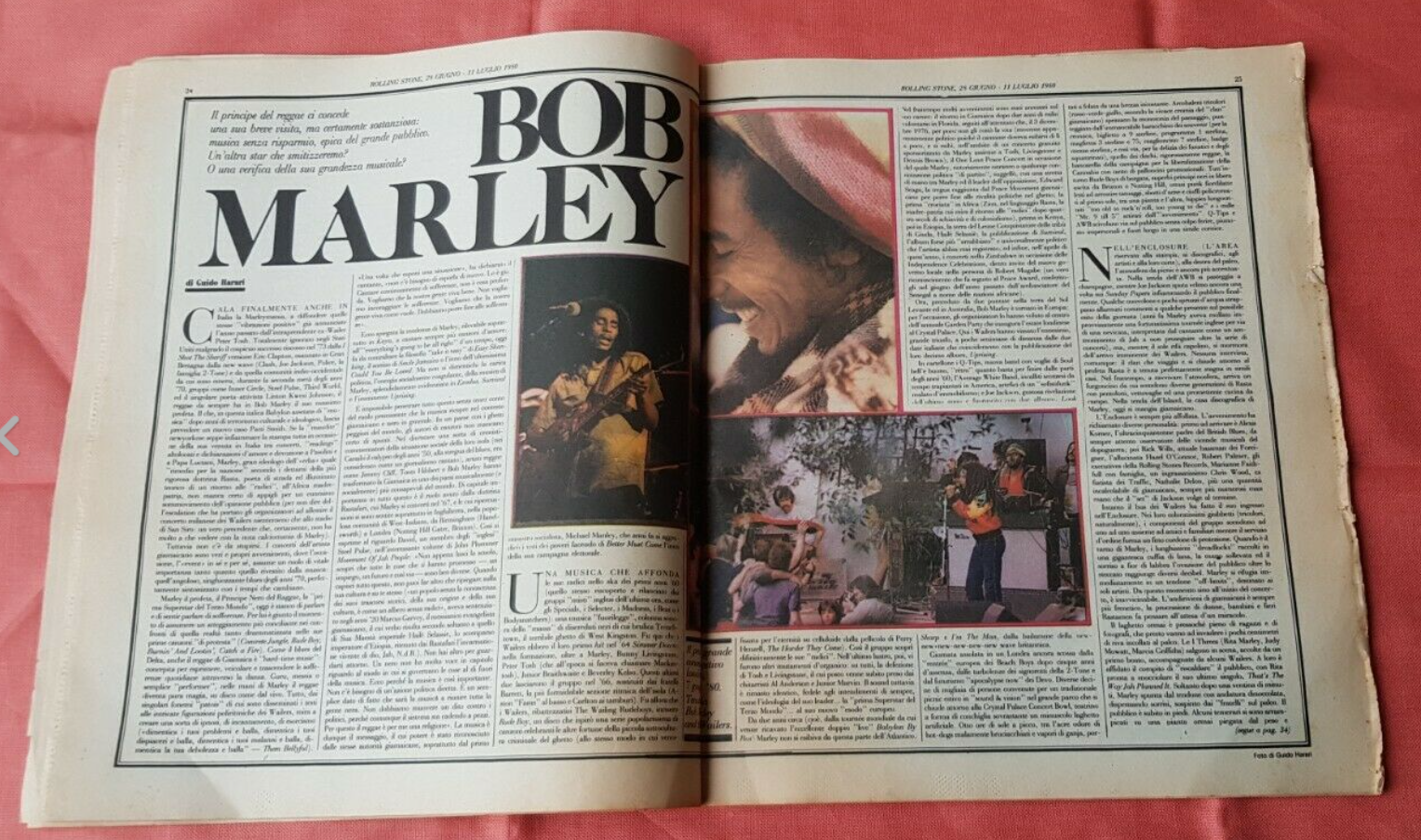
Most of the codices I have considered prefer a two-column structure, however some richly decorated ones present the text in a single block.
Consequently, I chose to keep a single block for the first section of the articles and set a bi-columnar structure for the rest of the text, testifying the co-existence of rigorous and variegate layout structures in an earlier era to the invention of printing.
In the columns, I minimized the margin between the paragraphs and unified the blockquotes to the rest of the text to make the layout more homogeneous and similar to the original examples. I set the column-gap property with a value of 5vw following the proportions of some examples I took into consideration. I used the overflow-wrap property with the value word-break to further increase the impression of homogeneity.
To give the impression of decorative density and density of the page, I preserved the absence of padding between the textual element and the marginalia, that is, the decorations that surround the manuscript page, because it is a characteristic that I found in most of the illuminated manuscripts taken into consideration.
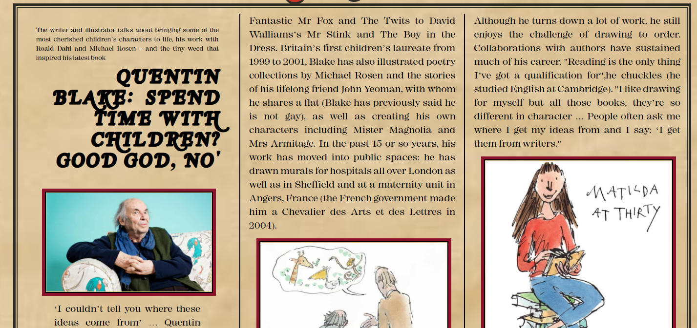
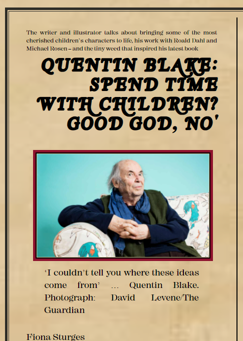
Cover section and headings
I set a larger font-size (230%) for the title than the rest of the text to highlight it and placed it on the center of the page. It was a personal choice because, in most of the texts I referred to, the text wasn't provided of a title. I set a slight space between the letters through the letter-spacing property and a value of 1 em. I capitalized it through the text-transform property and aligned it to the center.
I have adopted the same type of solution for the h2s, clearly reducing the size of the text.
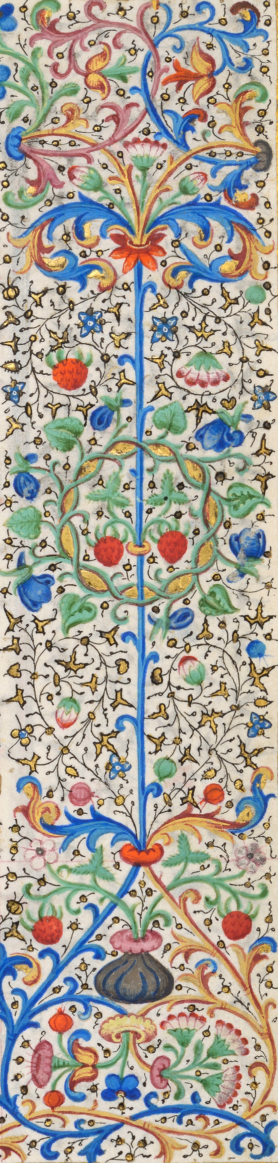
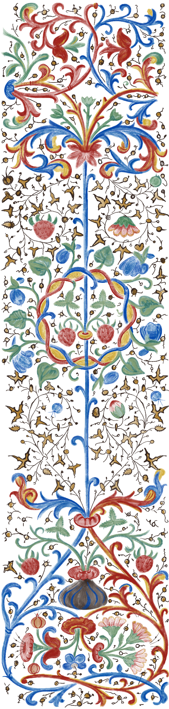
Borders and frames
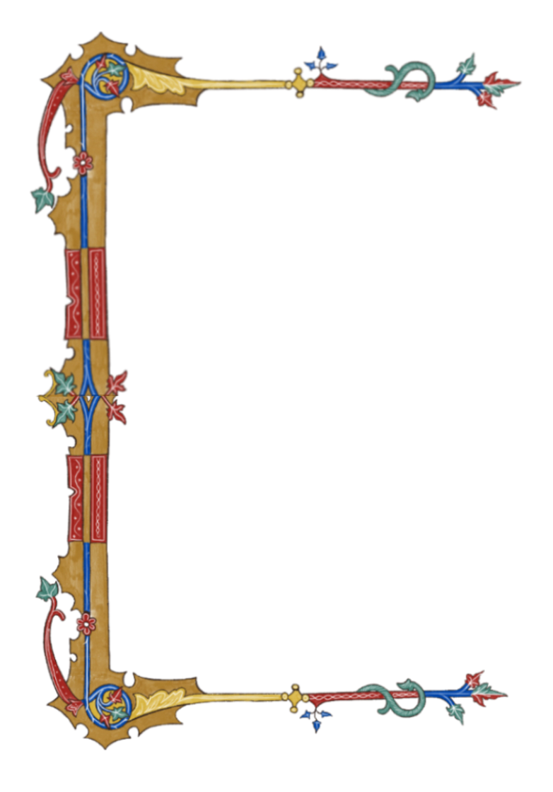
I wanted to accentuate the importance of the marginalia and the finely decorated borders that usually surrounded the text trying to preserve their ratio, but since there is no precise information about it- or better, it often variates- I tried to maintain a proportionality that was as close as possible to some examples I took into consideration.
I consequently set the border-left-width property with a value of 100 and a border-right-width of 200, having realized that often the left margin was half of the right one. Instead, I decided to give up the decorations of the upper and lower marginalia, because it would have compromised the readability of the text, which is much longer than the examples that inspired me, and it would have been impossible to preserve the design of the border itself without some unappealing distortions.
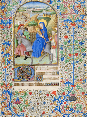
I then chose a further frame for the first section of the text, that is, the non-columned one, because I thought it offered a space open to decorations and that it certainly represented a possibility of filling that the illuminated manuscripts would never have given up.
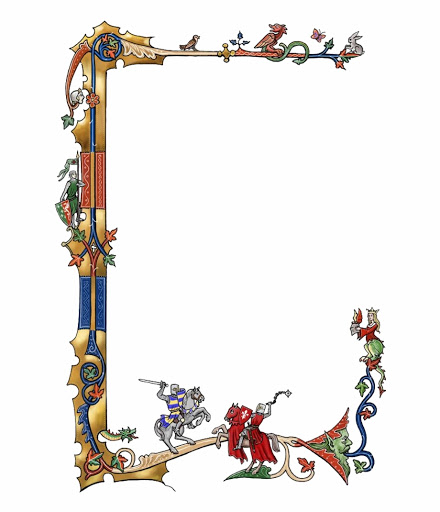
Since there are numerous frames on the web that recall the medieval period but sometimes they are rough remakes or in formats that are not compatible with the intent of inserting them in the layout, I decided to redraw them and export them in a PNG format, to comfortably adapt them to the background.
I therefore selected one of the marginalia that I considered most representative in terms of decorations and colors and redesigned it by changing some details to make it more adaptable to the context of insertion.
I then chose a suitable frame to embrace the first section of text and reproduced it using the same colors as the marginalia to make the final result more homogeneous.
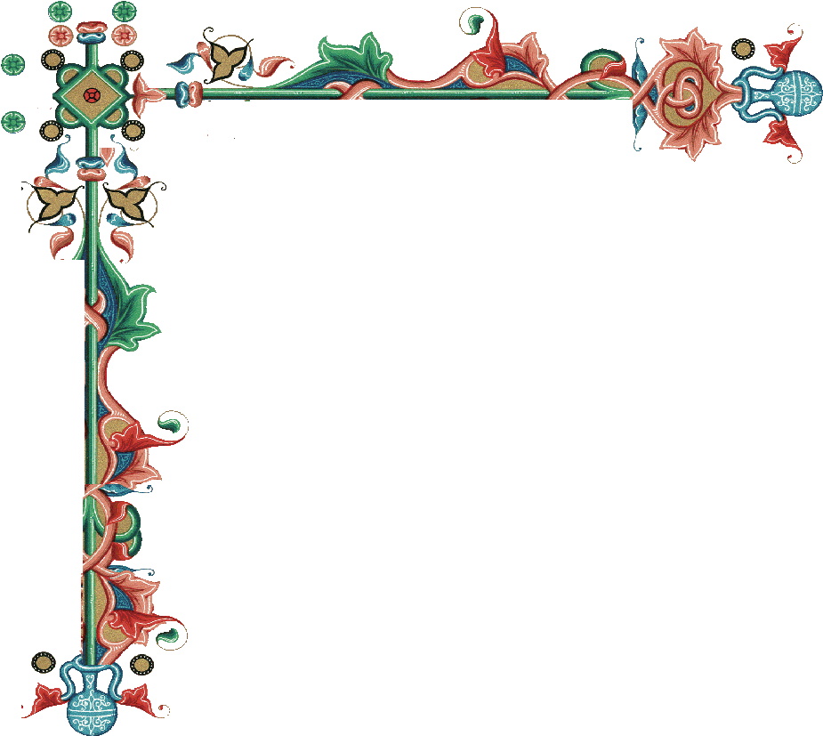
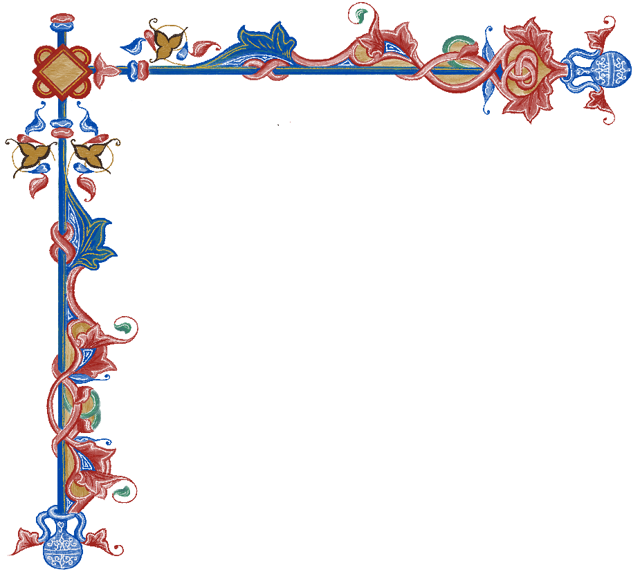
For the borders of the images, I opted for a double border with a gold-colored filling, that I obtained by combining the outline (5px solid #d4af37;), box-shadow (0 7px 0 0 #34251f; 0 7px 0 0 #34251f; 7px 0 0 0#34251f; 7px 0 0 0 #34251f; 0 0 0 7px #34251f;) and border (2px solid #34251f) properties. I found the golden frame solution in the most precious manuscripts I analyzed and therefore emulated it.

Decorations
- The ruling: in the Middle Ages the pages of the most precious manuscripts were characterized by the ruling, that is, by lines that served as a guide for scribes. The more important the book was, the more elaborate the ruling, and from this it is easy to deduce that the beautifully illuminated manuscripts had actual guidelines. In an attempt to recreate the impression of these guidelines, I decided to add a delicate underline to the text through the text-decoration property (0.3px underline). The choice to opacify it (text-decoration-color rgba(212, 31, 24, 0.07)) was then dictated by the fact that the ruling was sometimes done by exerting pressure with a blade on the parchment, and I wanted to re-create this impression.
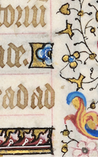
- The inside-the-text decorations: the text of the illuminated manuscripts was often interspersed with decorative elements, positioned on the same line as the text and often recalling the colors or motifs of the main decoration. I therefore selected one of these decorative elements by extrapolating it from a manuscript and then adapted it to the content of my articles. I used the same decoration as background-image of the h2s.
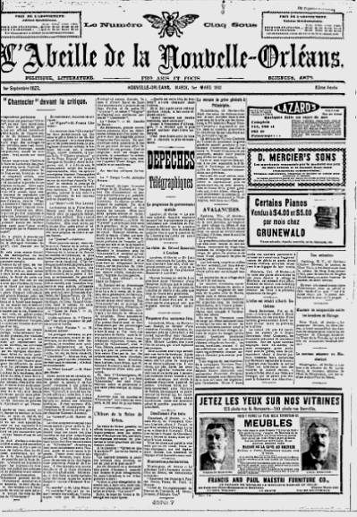
As for the typographic aspect, L’Abeille de la Nouvelle-Orléans is interesting because it uses different types of fonts for its pages, probably to highlight articles and inserts that would otherwise be too anonymous in a context so full of text.
Typography
- I therefore selected a font that echoes medieval writing, the Seagram, and I set the letter-spacing property with a value of -1.5px, that seemed to me the middle ground between not losing the historical rendering but not even legibility.
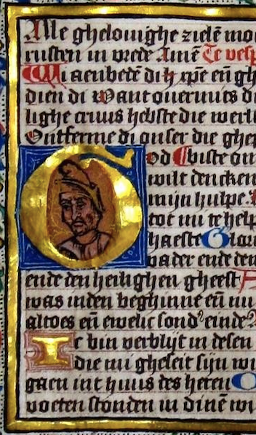
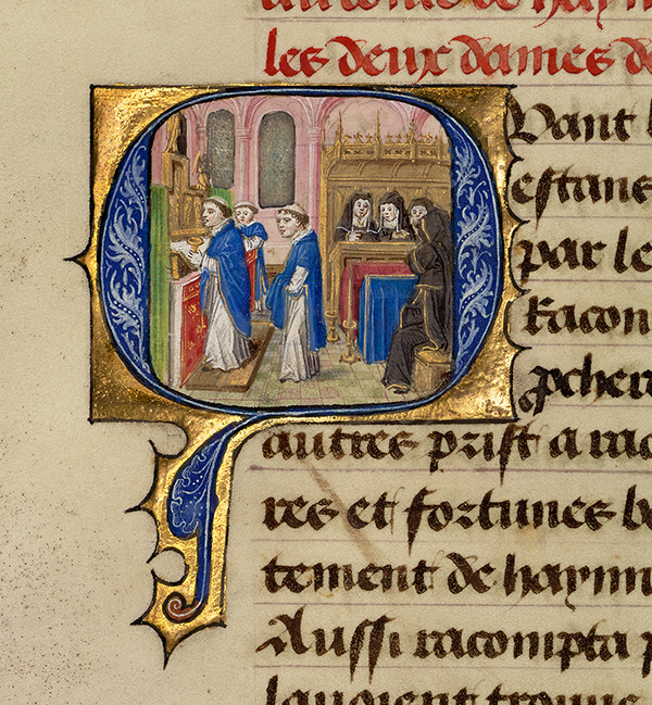
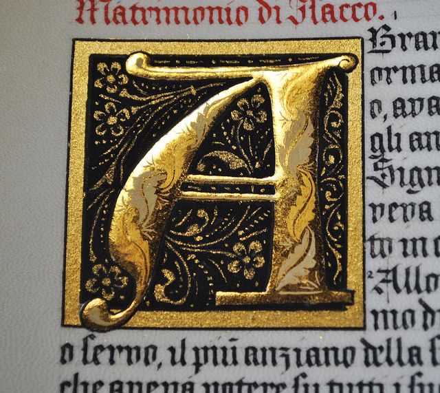
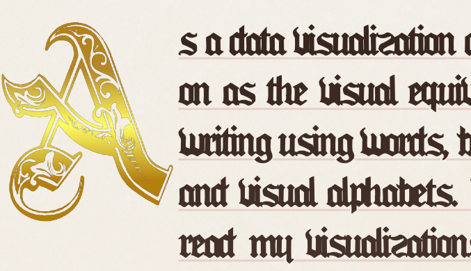
- The first pages of the codices I analyzed are often characterized by colored and golden decorated drop caps. To reproduce this effect, I therefore chose a decorative medieval font called Royal-7B3K, and I used a linear-gradient property selecting particularly bright shades of gold where I wanted to create a sort of glossy effect. I set the capital letter for every first section of the text through by selecting, through the Javascript function getElementsByTagName, every first paragraph of every second section (the first section being the cover) and adding a class (classList.add). Then I recalled in the CSS file and through the pseudo-selector ::first letter I set the values I wanted in the best way I could.
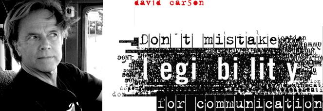
As for the typographic aspect, one of the evident characteristics of medieval manuscripts is, to us, the poor legibility of the handwriting, whose typeface is extremely distant from ours.

Colors
- Iron gall ink: for the body of the text. The use of this ink dates back to the first centuries after Christ, a favorite choice above all for its indelibility. Since the solutions proposed by the web were not exhaustive, I selected several color examples through a color-picker (the main ones being: #34251ff8 and #413029f6 hex colors), and I chose those closest to the originals. Since the illuminated manuscripts were written, of course, by hand, often different shades of ink were created on the sheet as the color “discharged”. This is why I chose to apply a linear-gradient with shades of colors close but more opaque to the main color.
- Carmine red or Cochineal(#960019 hex color): an insect-based color, used in illuminated manuscripts and with which I decided to render the titles and some of the blockquotes, since sometimes entire parts in red were found within the text.
- Cobalt blue (#0047AB hex color): with which I set some decorations and some elements of the borders
- Malachite green (#3C7A6E hex color): that I used for flower stems of the different borders and decorations.
- Gold: the choice of gold was certainly the most difficult one because finding the color closest to the very thin gold leaves that were used in the Middle Ages. Rather than looking for a color code that seemed too
fake
I used the color picker and experimented with various shades (#ae7f30, #b0863c and #fff77a hex colors) also through the use of the linear-gradient function of CSS.
For the choice of colors, after looking at many pages of codices and gathering information about the most used inks, I decided to use the following most used shades that I maintained for the elements of the text and for the redrawing of the borders and frames. Each color has been sometimes introduced in a context in which it has been opacized or adapted to the context, but the guideline remains the same.
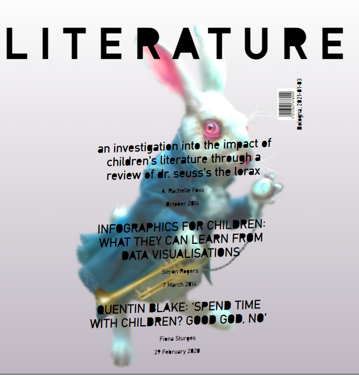
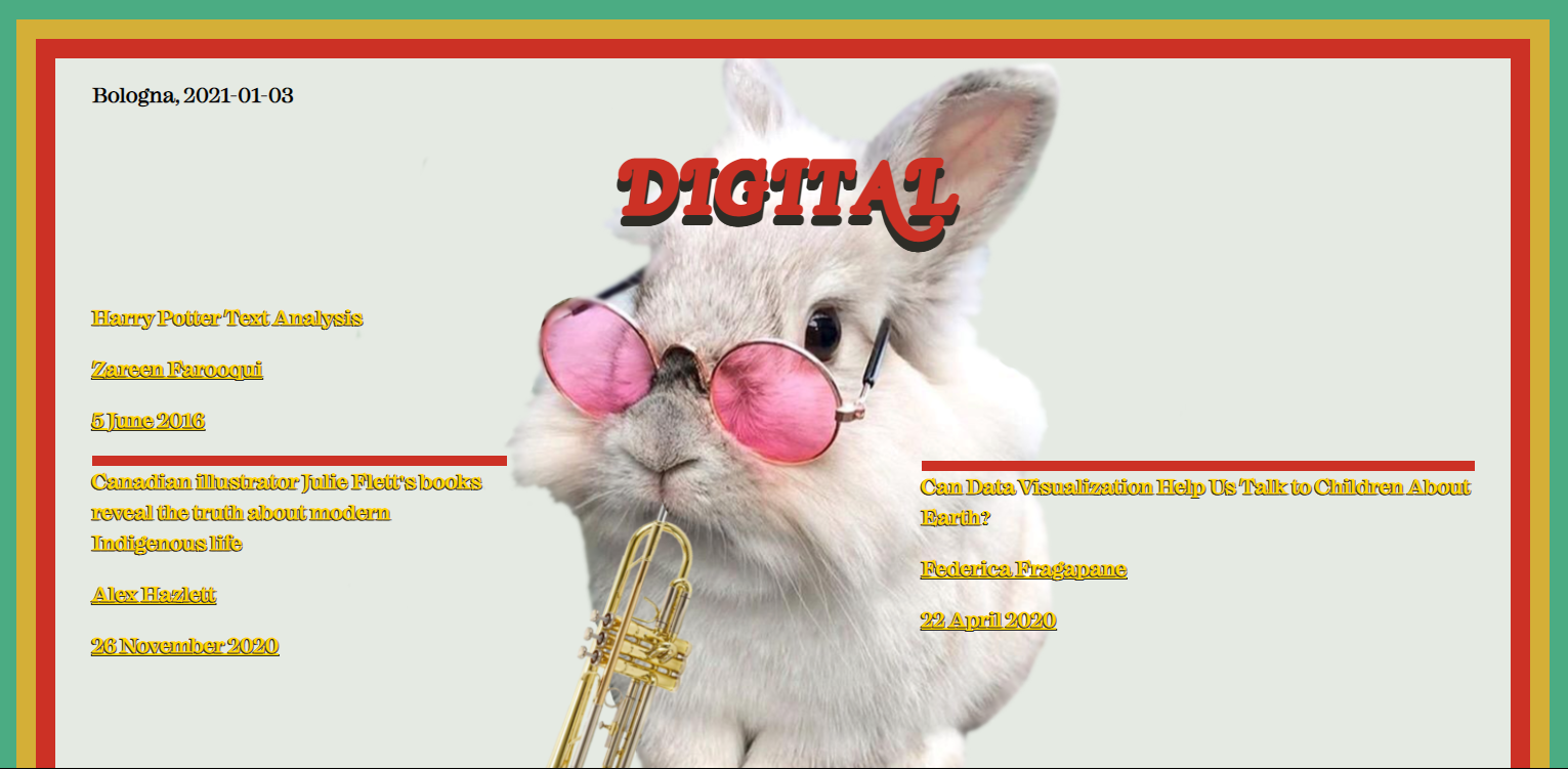
Cover
For the realization of the cover I opted for a less decorated and more empty solution, because I noticed that often, in the manuscripts I took as a model, the first pages were always more sparse in decorations than the actual body of the text, overloaded with details.
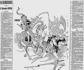
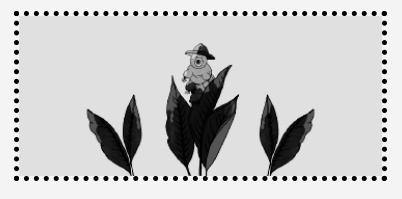
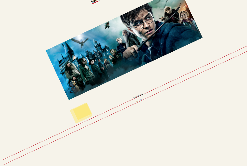
All the magazine covers feature the Alice in Wonderland rabbit as the protagonist, because we chose to present a special edition of our issues and it seemed to us the best character to embody time, a necessary element to travel through the centuries by selecting the different styles.
I looked for a rabbit that was as similar as possible among the many animal decorations and I set it through the background-image of the div containing all of the cover elements. I cut out the image and applied it mirrored and repeated on the four corners of the page through the background-position with values top, right, bottom, left.
I then chose a frame that seemed suitable for the context of insertion but since it contained elements in my opinion too caricatured and forced, I reproduced the frame following the model and using the same colors as all the other frames, decorative elements and the text of the 1450 style.
References
- the Wikipedia page about illuminated manuscripts: https://en.wikipedia.org/wiki/Illuminated_manuscript
- World History Source: https://chnm.gmu.edu/worldhistorysources/r/21/whm.html
- Medieval Illuminated Manuscripts: https://manuscripts.kb.nl/
- Britannica: https://www.britannica.com/art/illuminated-manuscript
- National Gallery of Art: https://www.nga.gov/conservation/paper/manuscript-project.html
- The Getty Museum: https://www.getty.edu/art/exhibitions/making/
- Medieval Manuscript Manual: http://web.ceu.hu/medstud/manual/MMM/ink.html


 >
>